
생활코딩 CSS
HTML과 CSS가 만나는 법
<!DOCTYPE html>
<html>
<head>
  <style>
    h2{color:blue}
  </style>
</head>
<body>
  <h1 style="color:red">Hello World</h1>
  <h2>Hello world</h2>
</body>
</html>
선택자와 선언

selector = 선택자
declaration = 선언문
property = 속성
value = 속성값
아이디 선택자
|
<!DOCTYPE html>
<html>
<head>
<style>
li {
color: red;
text-decoration: underline;
}
#select {
font-size: 50px;
}
</style>
</head>
<body>
<ul>
<li>HTML</li>
<li id="select">CSS</li>
<li>JavaScript</li>
</ul>
</body>
</html>
|
id 속성을 사용하고,
속성 값을 주면 그 속성 값에 해당하는 태그를 css에서 선택할 때 그 태그의 이름 앞에 샾 '#'을 준다.
클래스 선택자
|
<!DOCTYPE html>
<html>
<head>
<style>
li {
color: red;
text-decoration: underline; --> 태그 선택자
}
#select {
font-size: 50px; --> id 선택자
}
.deactive {
text-decoration: line-through; --> 클래스 선택자
}
</style>
</head>
<body>
<ul>
<li class="deactive">HTML</li>
<li id="select">CSS</li>
<li class="deactive">JavaScript</li>
</ul>
</body>
</html>
|
class는 어떤 대상을 관리하기 쉽도록 grouping 하는 것
id는 고유한 값이므로 한 번만 사용
부모 자식 선택자
앞서 배운 선택자들로는 섬세한 작업이 안된다. 정교한 선택을 가능하게 하는 선택자를 배워보자.
|
<!DOCTYPE html>
<html>
<head>
<style>
ul li { // <ul> 안에 있는 <li>에 적용
color: red;
}
#lecture>li { // id가 lecture인 값 안에 있는 <li>에 적용
border: 1px solid red;
color:blue;
}
ul,ol { // <ul>, <ol> 둘 다 적용
background-color: powderblue;
}
</style>
</head>
<body>
<ul>
<li>HTML</li>
<li>CSS</li>
<li>JavaScript</li>
</ul>
<ol id="lecture">
<li>HTML</li>
<li>CSS
<ol>
<li>selector</li>
<li>declaration</li>
</ol>
</li>
<li>JavaScript</li>
</ol>
</body>
</html>
|
선택자 공부팁
선택자는 css에서 주어 같은 역할을 하기 때문에 굉장히 중요하다. css가 발달함에 따라 다양한 선택자가 폭발적으로 증가했다. 그렇기 때문에 그 많은 선택자를 기억하고 있을 필요 없고...
가상 클래스 선택자
= 여러가지 선택을 하게 하는 선택자
= 각각의 element의 상태에 따라 element를 선택하는 선택자
<!DOCTYPE html>
<html>
<head>
<meta charset="UTF-8">
<style>
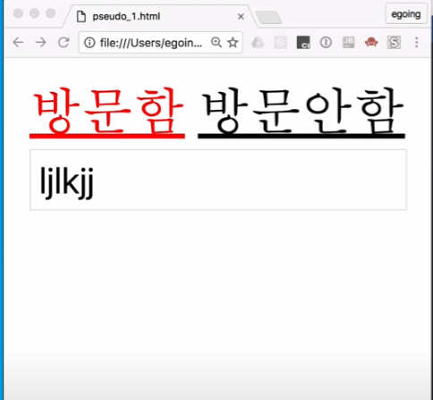
a:link{ /* 방문하지 않은 색 */
color:black;
}
a:visited{ /* 방문한 색 */
color: red;
}
a:hover{ /* 마우스 커서를 올렸을 때 색 */
color:yellow;
}
a:active{ /* 마우스 클릭 유지할 때 색 */
color:green;
}
a:focus{ /* <a> 태그에 포커스를 주는 */
color:white;
}
input:focus{ /* input 태그에 포커스를 주는 */
background-color: black;
color: white;
}
</style>
</head>
<body>
<a href="https://opentutorials.org">방문함</a>
<a href="https://a.a">방문안함</a>
</body>
</html>
속성을 공부하는 방법
선택자
= 사람의 말에서 주어에 해당하는 것
주어와 함께 그 문장을 구성하는 핵심은 서술어고, 서술어에 해당되는 것들이 css에서 선언부에 해당됨.
선언부에 있는 구체적인 효과 하나하나를 속성 property라고 함.
타이포 그래피 : font-size
= 가장 많이 사용되는 속성
= 쉽지만 단위가 좀 어려움
| px, em, rem = px, em은 오래 전부터 있던 단위고, rem은 최근에 추가된 단어임 px = 우리가 지정한 폰트의 크기가 고정되어 있음. (고정된 폰트의 크기를 지정할 때) em, rem = 우리가 브라우저의 설정을 바꾸면 폰트의 크기가 달라짐. (페이지의 폰트를 가변적으로 변경해서 지정할 때) |
오늘 날에는 rem을 많이 씀
= 폰트 크기를 조정할 수 있는 사용자의 권리를 존중하기 위해
|
<!DOCTYPE html>
<html>
<head>
<style>
#px{font-size: 16px;}
#rem{font-size: 1rem;}
</style>
</head>
<body>
<div id="px">PX</div>
<div id="rem">REM</div>
</body>
</html>
|
위의 코드에서 px는 크롬 창에서 폰트 크기를 조정해도 그대로인 반면,
rem은 조정한 만큼 사이즈가 변경됨
타이포그래피 : color
= 폰트에 컬러를 지정하는 속성
= 쉽지만 원하는 컬러를 지정하는 게 헷갈릴 수 있음
| color hex rgb |
|
<!DOCTYPE html>
<html>
<head>
<style>
h1{color:#00FF00;}
</style>
</head>
<body>
<h1>Hello world</h1>
</body>
</html>
|
타이포 그래피 : text-align
= 텍스트를 정렬하는 방법 (왼쪽, 오른쪽, 가운데, 양쪽을 균등하게 정렬하는 방법)
|
<!DOCTYPE html>
<html>
<head>
<style>
p {
text-align: justify;
border: 1px solid gray;
}
</style>
</head>
<body>
<p>
text
</p>
</body>
</html>
|
타이포 그래피 : font
= font-size보다 덜 중요하지만 폰트와 관련된 이런 저런 속성
| font-family = 글꼴을 지정하는 방법 font-weight = 폰트의 두께를 표현하는 방법 line-height = 글자의 행과 행 사이의 간격 font-property = 위의 속성들을 축약해서 표현하는 방법 |
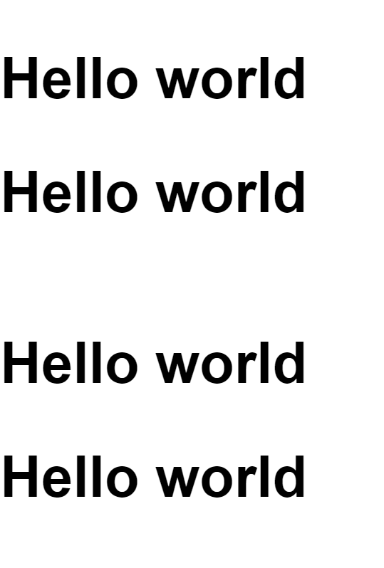
<!DOCTYPE html>
<html>
  <head>
    <style>
      #type1{
        font-size:5rem;
        font-family: arial, verdana, "Helvetica Neue", serif;
        font-weight: bold;
        line-height: 2;
      }
      #type2{
        font:bold 5rem/2 arial, verdana, "Helvetica Neue", serif; //위의 것을 다 합친 속성
      }
    </style>
  </head>
  <body>
    <p id="type1">
      Hello world<br>
      Hello world
    </p>
    <p id="type2">
      Hello world<br>
      Hello world
    </p>
  </body>
</html>
타이포 그래피 : 웹 폰트
= 웹 폰트를 사용하는 게 꼭 바람직하지만은 않기 때문에 나중에 배워도 됨
상속

<!DOCTYPE html>
<html>
  <head>
    <style>
      /* li{color:red;}
      h1{color:red;} */
      html{color:red;} /* 전체 <html> 태그 선택 */
      #select{color:black;} /* id선택자만 선택 */
      body{border:1px solid red;} /* <body> 태그 전체 선택 */ (상속되지 않음)
    </style>
  </head>
  <body>
    <h1>수업내용</h1>
    <ul>
      <li>html</li>
      <li>css</li>
      <li id="select">javascript</li>
    </ul>
  </body>
</html>
폰트의 컬러는 상속되고, 테두리는 상속되지 않는다.
Stylish
= 플러그인, 또는 유저 스타일을 활용해 웹 페이지의 디자인이나 표현을 우리의 취향에 따라 커스터마이징 할 수 있는 방법
캐스케이딩 cascading
= css 중요 기능
= 웹 브라우저 사용자도 자기가 보고자 하는 웹 페이지 디자인에 대한 결정권이 있어야 하는 목적
캐스케이딩 규칙
= 1개의 태그에 여러 css 효과가 중첩되었을 때 우선 순위에 대한 규칙
|
<!DOCTYPE html>
<html>
<head>
<style>
li{color:red !important;} /* 우선순위 됨 */
#idsel{color:blue;}
.classsel{color:green;}
</style>
</head>
<body>
<ul>
<li>html</li>
<li id="idsel" class="classsel" style="color:powderblue">css</li> /* 중첩된 css가 적용됐을 때 중요 순서가 다름 */
<li>javascript</li>
</ul>
<ol>
<li>style attribute</li> /* 가장 구체적 */
<li>id selector</li>
<li>class selector</li>
<li>tag selector</li> /* 가장 포괄적 */
</ol>
</body>
</html>
|
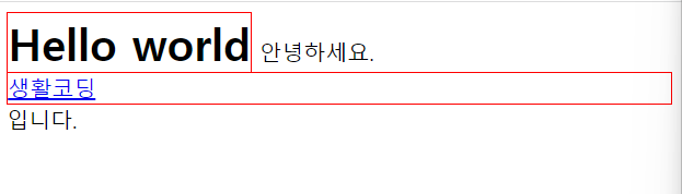
inline block
html의 여러 태그들은 성격에 따라서 화면 전체를 쓰는 태그와 자기 자신의 크기만큼을 사용하는 태그로 나눠진다.
| 1. in-line 2. block-level-tag = block-level-element |
|
<!DOCTYPE html>
<html>
<head>
<style>
h1, a {border: 1px solid red;}
h1 {display: inline} /* 내용 크기만큼 공간 차지 */
a {display: block} /* 화면 전체 공간 차지 */
</style>
</head>
<body>
<h1>Hello world</h1>
안녕하세요. <a href="https://opentutorials.org">생활코딩</a>입니다.
</body>
</html>
|
box model
= 각각의 태그들이 웹 페이지에 표현될 때 그 태그의 부피감을 결정한다.
= 여백, 위치, 크기 같은 것을 결정한다.

<!DOCTYPE html>
<html>
<head>
  <style>
    p, a {
      border: 10px solid red;
      padding: 20px; /* 테두리 간격 */
      margin: 40px; /* element와 element 사이의 간격 */
      width: 120px;
    }
  </style>
</head>
<body>
  <p>
    Lorem ipsum dolor sit amet consectetur adipisicing elit. Ex, nostrum.
  </p>
  <p>
    Lorem ipsum dolor sit amet consectetur adipisicing elit. Ex, nostrum.
  </p>
  안녕하세요. <a href="https://a.com">생활코딩</a>입니다.
</body>
</html>
in-line 방식은 width와 height 방식이 적용되지 않는다. border, padding, margin만 적용됨..
<a> 태그가 in-line 방식인건가?
box-sizing
element에 width나 height를 지정할 때,
그 element가 padding이나 border 값을 가지고 있는 경우 우리가 지정한 사이즈가 예상한 것과 다르게 된다.
언제 그렇게 되는지 살펴보고 그 문제를 해결해서 어떤 element의 크기를 예측하기 쉽도록 한다

선택자에게 box-sizing border를 줘서 모든 element 크기를 width와 height의 값으로 사용할 수 있게 해 코딩을 수월하게 한다.
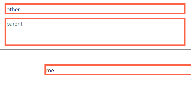
포지션1 : relative vs. static
| static = 부모에 고정 = 있어야 하는 위치에 고정 |
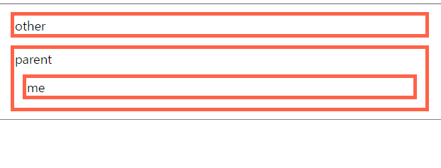
| <!DOCTYPE html>
<html>
<head>
<style>
html{border: 1px solid gray;}
div{
border:5px solid tomato;
margin: 10px;
}
#me{
position: static;
left: 100px;
top: 100px;
}
</style>
</head>
<body>
<div id="other">other</div>
<div id="parent">
parent
<div id="me">me</div>
</div>
</body>
</html>
|
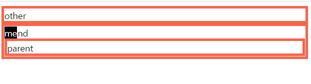
| relative = 부모를 기준으로 이동 |
|
<!DOCTYPE html>
<html>
<head>
<style>
html{border: 1px solid gray;}
div{
border:5px solid tomato;
margin: 10px;
}
#me{
position: relative;
left: 100px;
top: 100px;
}
</style>
</head>
<body>
<div id="other">other</div>
<div id="parent">
parent
<div id="me">me</div>
</div>
</body>
</html>
|
포지션2 : absolute
= 부모를 무시하고 이동
= fixed처럼 스크롤을 내려도 따라가는 게 아니라, 그 자리에 가만히 있음
|
<!DOCTYPE html>
<html>
<head>
<style>
#parent, #other, #grand{
border:5px solid tomato;
}
#grand{
position: relative;
}
#me{
background-color: black;
color:white;
position: absolute;
left:0;
top:0;
}
</style>
</head>
<body>
<div id="other">other</div>
<div id="grand">
grand
<div id="parent">
parent
<div id="me">me</div>
</div>
</div>
</body>
</html>
|
포지션3 : fixed
= 스크롤에서 독립적으로 움직임
= 스크롤을 내려도 #me element가 고정된다.

|
<!DOCTYPE html>
<html>
<head>
<style>
#parent, #other {
border:5px solid tomato;
}
#large{
height: 10000px;
background-color: tomato;
}
#me{
background-color: black;
color:white;
position: fixed;
left:0;
top:0;
}
</style>
</head>
<body>
<div id="other">other</div>
<div id="parent">
parent
<div id="me">me</div>
</div>
<div id="large">large</div>
</div>
</body>
</html>
|
fixed도 absolute처럼 width와 height 값을 지정하지 않으면 딱, 자기 컨텐츠 크기가 된다는 것이 특징이다.
flex1 : intro
| flex = element들의 크기나 위치를 쉽게 잡아주는 도구이다. |
지금까지 레이아웃과 관련된 다양한 속성들이 있었지만 그리 효과적이지 않았다.
flex를 이용하면 레이아웃을 효과적으로 표현할 수 있다.
flex에서 활용하는 요소
<container>
    <item></item>
    <item></item>
</container>
container
    display
    flex-direction
    flex-wrap
    flex-flow
    justify-content
    align-items
    align-content
item
    order
    flex-grow
    flex-shrink
    flex-basis
    flex
    align-self
flex의 기본 사용법
flex를 사용하기 위해서는 <container> 태그에 display: flex 속성을 부여해야 한다.
또한 flex-direction을 이용해 정렬 방향을 바꿀 수 있다. 기본은 row다.
|
<!DOCTYPE html>
<html>
<head>
<style>
.container{
background-color: powderblue;
height: 200px;
display: flex;
flex-direction: column-reverse;
}
.item{
background-color: tomato;
color: white;
border: 1px solid white;
}
</style>
</head>
<body>
<div class="container">
<div class="item">1</div>
<div class="item">2</div>
<div class="item">3</div>
<div class="item">4</div>
<div class="item">5</div>
</div>
</body>
</html>
|
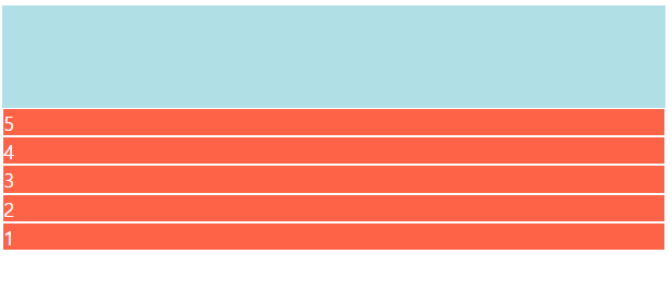
grow & shrink
= item이 container의 크기에 따라 작아지기도 하고 커지기도 하는 비율을 지정하는 방법

|
<!doctype>
<html>
<head>
<style>
.container{
background-color: powderblue;
height:200px;
display:flex;
flex-direction:row;
}
.item{
background-color: tomato;
color:white;
border:1px solid white;
}
.item:nth-child(1){
flex-basis: 150px;
flex-shrink: 1; // 화면이 줄어들 때 1/3만큼 같이 줄어듬
}
.item:nth-child(2){
flex-basis: 150px;
flex-shrink: 2; // 화면이 줄어들 때 2/3만큼 같이 줄어듬
}
</style>
</head>
<body>
<div class="container">
<div class="item">1</div>
<div class="item">2</div>
<div class="item">3</div>
<div class="item">4</div>
<div class="item">5</div>
</div>
</body>
</html>
|
| flex 삼총사 1. flex-basis = item의 기본 크기를 지정한다. = flex-grow나 shrink로 늘어나거나 줄어들기 전의 기본 크기를 설정한다. = flex-direction이 row라면 basis는 가로, column은 세로를 의미한다. 2. flex-grow = item이 기본 값을 넘어 넓어질 수 있는지 설정한다. = 1만 줘도 화면 끝까지 다 채운다. item을 화면에 꽉 채우는데 유용하다. 1이면 늘어나고 0이면 안 늘어난다. |

|
.box:nth-child(2) {
background: lightblue;
flex-grow: 1;
}
.box:nth-child(3) {
background: lightyellow;
flex-grow: 2;
}
|
1이상의 값을 줌으로서 늘어나는 비율을 설정할 수 있다.
| 3. flex-shrink = flex에서 item은 width 값을 주어도, 화면이 줄어들면 width 값을 무시하고 줄어든다. 브라우저 가로 길이를 줄이면 박스가 알아서 줄어든다. 이는 flex-shrink의 기본 값이 '1' 줄어듦이다. 크기를 유지하고 싶을 때는 0 사용한다. |
|
.box:nth-child(2) {
background: lightblue;
flex-shrink: 0;
}
|

다른 건 줄어들어도 flex-shrink를 0으로 준 2번째 item은 줄어들지 않는 것을 확인할 수 있다.
Holy Grail Layout
많은 사람들이 아래와 같은 레이아웃을 만들기 위해 노력했지만 완벽한 방법을 찾지 못했다.
flex는 세련된 방법으로 이 문제를 간편하게 해결한다.
flex를 이용해 성배 레이아웃을 만드는 법을 알아보자.


|
<!DOCTYPE html>
<html>
<head>
<meta charset="utf-8">
<style>
.container{
display: flex;
flex-direction: column; /* 배열을 수직으로 */
}
header{
border-bottom: 1px solid gray;
padding-left: 20px;
}
footer{
border-top: 1px solid gray;
padding: 20px;
text-align: center;
}
.content{
display: flex;
}
.content nav{
border-right: 1px solid gray;
}
.content aside{
border-left: 1px solid gray;
}
nav, aside{
flex-basis: 150px;
flex-shrink: 0;
}
main{
padding: 10px;
}
</style>
</head>
<body>
<div class="container">
<header>
<h1>생활코딩</h1>
</header>
<section class="content">
<nav>
<ul>
<li>html</li>
<li>css</li>
<li>javascript</li>
</ul>
</nav>
<main>
Lorem ipsum1
</main>
<aside>
AD
</aside>
</section>
<footer>
<a href="https://naver.com">홈페이지</a>
</footer>
</div>
</body>
</html>
|
media query
= 화면의 종류와 크기에 따라서 디자인을 달리 줄 수 있는 css 기능
= 특히 최근 트렌트인 반응형 디자인인 핵심 기술이라고 할 수 있음
<!DOCTYPE html>
<html>
<head>
  <meta name="viewport" content="width=device-width, initial-scale=1.0"> /*모바일에서 보기 편하게*/
  <style>
    @media (max-width:600px){  /*비슷한 조건일 때 먼저 있는 게 우선 순위*/
      body{
        background-color: green;
      }
    }
    @media (max-width:500px){ /*화면 크기 500px 이하일 때 배경색 변화*/
      body{
        background-color: red;
      }
    }
    @media (min-width: 601px){  /*화면 크기 601px 이상일 때 배경색 변화*/
      body{
        background-color: blue;
      }
    }
  </style>
</head>
<body>

</body>
</html>


float1
= 텍스트를 이미지처럼 삽입할 때 쓰는 기능

|
<!DOCTYPE html>
<html>
<head>
<style>
img{
width: 300px;
float: right; /* 이미지를 글처럼 삽입 (오른쪽에 이미지 배치) */
margin: 20px;
}
p{
border: 1px solid gray;
}
</style>
</head>
<body>
<img src="jeno.jpg" alt="">
<p>
Lorem ipsum dolor sit amet consectetur adipisicing elit. Dolorem, cumque dolorum delectus ipsam, ipsum autem voluptatibus vel omnis, fugit libero odio architecto.
</p>
<p style="clear:both;"> /* 텍스트가 이미지를 피해감 (이미지가 left든 right에 있든 무조건 피한다는 both 사용) */
Lorem ipsum dolor sit amet consectetur adipisicing elit. Dolorem, cumque dolorum delectus ipsam, ipsum autem voluptatibus vel omnis, fugit libero odio architecto.
</p>
</body>
</html>
|
float2 : holy grail layout
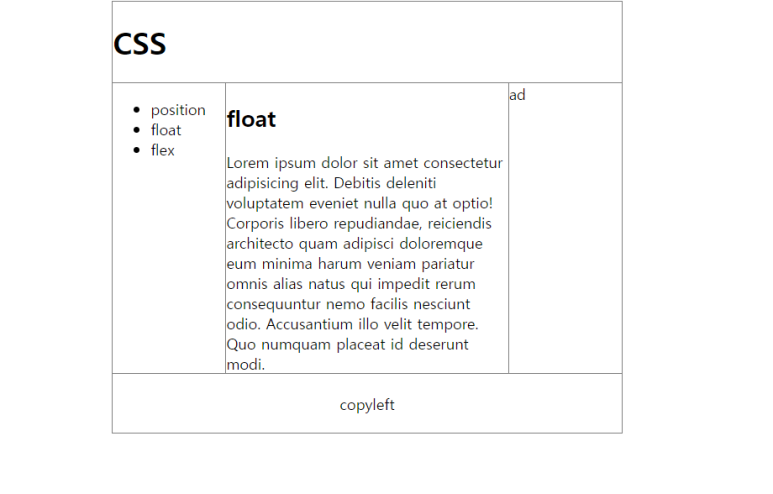
<!DOCTYPE html>
<html>
<head>
  <style>
    *{
      box-sizing: border-box;
    }
    .container{
      width: 540px;
      border: 1px solid gray; /* container 크기가 고정됐기 때문에 화면의 크기와 상관 없이 레이아웃이 깨지지 않음 */
      margin: auto; /* 양쪽이 공평하게 나눠짐 */
    }
    header{
      border-bottom: 1px solid gray;
    }
    nav{
      float: left;
      width: 120px;
      border-right: 1px solid gray;
    }
    article{
      float: left;
      width: 300px;
      border-left: 1px solid gray;
      border-right: 1px solid gray;
      margin-left:-1px; /* 깔끔한 선 만들기 */
    }
    aside{
      float: left;
      width: 120px;
      border-left: 1px solid gray;
      margin-left:-1px;
    }
    footer{
      clear: both;
      border-top: 1px solid gray;
      text-align: center;
      padding: 20px;
    }
  </style>
</head>
<body>

  <div class="container">
    <header>
      <h1>
        CSS
      </h1>
    </header>

    <nav>
      <ul>
        <li>position</li>
        <li>float</li>
        <li>flex</li>
      </ul>
    </nav>

    <article>
      <h2>float</h2>
    Lorem ipsum dolor sit amet consectetur adipisicing elit. Debitis deleniti voluptatem eveniet nulla quo at optio! Corporis libero repudiandae, reiciendis architecto quam adipisci doloremque eum minima harum veniam pariatur omnis alias natus qui impedit rerum consequuntur nemo facilis nesciunt odio. Accusantium illo velit tempore. Quo numquam placeat id deserunt modi.
    </article>

    <aside>
      ad
    </aside>

    <footer>
      copyleft
    </footer>
  </div>

</body>
</html>
multi column
= 신문과 같이 화면의 크기가 큰 매체에서 사용하는 전통적인 레이아웃 기법
= 컬럼을 조각조각 나눠서 읽기 편하게 한다.

<!DOCTYPE html>
<html>
<head>
  <meta charset="UTF-8">
  <meta name="author" content="egoing">
  <style>
    .column{
      text-align: justify;
      column-count: 4;
      /* column-width: 200px; 컬럼 하나당 가로 크기 */
      column-gap: 30px; /*컬럼사이간격*/
      column-rule-style: solid; /*solid한 단선 이외 dash,dotted 있음*/
      column-rule-width: 1px; /*단선두께*/
      column-rule-color: red;
    }
    h1{
      column-span: all; /*글자가 컬럼에 구애받지않고 자유롭게 공간차지*/
    }
  </style>
</head>
<body>
  <div class="column">
    Lorem ipsum, dolor sit amet consectetur adipisicing elit. Deserunt dolores aliquam saepe eligendi, praesentium quam porro repellendus ipsa vero alias, eius expedita voluptatum dolorum maxime minima reiciendis nihil, modi mollitia? Unde ex officia non eius mollitia temporibus distinctio obcaecati, provident voluptatem assumenda harum aliquid fugiat hic, aliquam debitis vitae sapiente quod. Et perspiciatis corporis eligendi neque rem, impedit distinctio beatae, aut fugiat consectetur eius hic facilis omnis id, est architecto minus expedita voluptates consequatur dolorem! Eligendi porro at dolorem sapiente culpa repellat! Eum, voluptates aperiam earum laborum neque laboriosam, vero, error praesentium modi deleniti recusandae doloribus
    <h1>Lorem ipsum dolor sit amet consectetur adipisicing elit. Minima, aspernatur?</h1>
    libero quaerat optio ducimus. Architecto odit nisi inventore voluptate laudantium, explicabo officiis soluta consequuntur accusantium assumenda magni voluptatum quod dolores vel rerum cum, dolorum repudiandae illum culpa quia.
  </div>
</body>
</html>
배경 background
= 특정 element에 배경 이미지, 배경 컬러를 지정하는 효과
배경 중요 속성
|
background-color: red
background-image: url("bg.png")
background-repeat: repeat, no-repeat, repeat-x, repeat-y
background-attachment: scroll, fixed
background-position: lefttop or x% y% or x y
background-size: 100px 100px or cover or contain
|
필터 filter
= 이미지, 텍스트에 여러가지 효과 주는 기능 (컬러 이미지를 흑백으로 바꾼다든지 하는 기능)
= 원본 이미지를 유지
|
<!DOCTYPE html>
<html>
<head>
<style>
img{
transition: all 1s; /* hover 되었을 때 효과 걸리는데 1초 */
}
img:hover{
-webkit-filter: grayscale(100%) blur(3px);
-o-filter: grayscale(100%) blur(3px);
filter:grayscale(100%) blur(3px);
}
h1{
-webkit-filter: blur(3px);
-o-filter: blur(3px);
filter:blur(3px);
}
</style>
</head>
<body>
<h1>JENO</h1>
<img src="jeno.jpg" alt="">
</body>
</html>
|
참고 사이트
https://bennettfeely.com/image-effects/
Image Effects with CSS
A collection of CSS snippets to create fast, complex image effects for websites
bennettfeely.com
혼합 blend
= 2개 이상 이미지를 겹쳤을 때 서로 다른 색상 차이를 여러가지 기준에 따라 혼합해서 효과를 만드는 기능
| background-blend-mode = 배경 그래픽 간의 blend 효과 (배경 background끼리 적용되는 blend 효과) |
|
<!DOCTYPE html>
<html>
<head>
<style>
.blend{
height: 400px;
border: 5px solid;
background-color: rgba(255,0,0,0.5);
background-size: cover;
background-image: url('jeno.jpg');
background-blend-mode: saturation;
transition: background-color 10s; /* 장면 전환이 빠져 나가는데 10초 걸림 */
}
.blend:hover{
background-color: rgba(255,0,0,1);
transition: background-color 5s; /* 장면 전환이 5초 걸림 */
}
</style>
</head>
<body>
<div class="blend"></div>
</body>
</html>
|
saturation 외에도 여러가지 background-blend-mode 있음
| mix-blend-mode = content와 배경 사이의 blend 효과 (blend를 주고 싶은 대상과 background image 사이에 합성 효과) |
|
<!DOCTYPE html>
<html>
<head>
<style>
body{
background-image: url(jeno.jpg);
}
.blend{
font-size: 2rem;
font-weight: bold;
color: red;
mix-blend-mode: screen;
}
</style>
</head>
<body>
<div class="blend">
<h1>Lorem ipsum, dolor sit amet consectetur adipisicing elit. Sed, ipsa!</h1>
Lorem ipsum dolor sit amet, consectetur adipisicing elit. Dolorem sequi pariatur voluptate distinctio eos magni rem quis ea molestias sunt reprehenderit temporibus laudantium officiis sed sint veniam nulla, ad veritatis libero numquam ullam suscipit perferendis! Esse impedit, sunt nemo reprehenderit eveniet, adipisci similique, ratione ad magni asperiores aperiam numquam enim.
</div>
</body>
</html>
|
전

후

변형 transform
= element의 크기, 위치, 모양을 변경하는 속성
|
<!DOCTYPE html>=
<html>
<head>
<style>
h1{
background-color: deepskyblue;
color: white;
display: inline-block;
padding: 5px;
font-size: 3rem;
margin: 30px;
transform: scale(0.5,0.5); /* 크기를 0.5배 줄인다*/
}
</style>
</head>
<body>
<h1>Hello transform</h1>
</body>
</html>
|
/* Keyword values */

transform: none;


/* Function values */

transform: matrix(1.0, 2.0, 3.0, 4.0, 5.0, 6.0);

transform: translate(12px, 50%);

transform: translateX(2em);

transform: translateY(3in);

transform: scale(2, 0.5);

transform: scaleX(2);

transform: scaleY(0.5);

transform: rotate(0.5turn);

transform: skew(30deg, 20deg);

transform: skewX(30deg);

transform: skewY(1.07rad);

transform: matrix3d(1.0, 2.0, 3.0, 4.0, 5.0, 6.0, 7.0, 8.0, 9.0, 10.0, 11.0, 12.0, 13.0, 14.0, 15.0, 16.0);

transform: translate3d(12px, 50%, 3em);

transform: translateZ(2px);

transform: scale3d(2.5, 1.2, 0.3);

transform: scaleZ(0.3);

transform: rotate3d(1, 2.0, 3.0, 10deg);

transform: rotateX(10deg);

transform: rotateY(10deg);

transform: rotateZ(10deg);

transform: perspective(17px);


/* Multiple function values */

transform: translateX(10px) rotate(10deg) translateY(5px);


/* Global values */

transform: inherit;

transform: initial;

transform: unset;
https://codepen.io/vineethtrv/pen/XKKEgM
Css3 Transform
CSS3 Transform models ...
codepen.io
transform2
|
<!DOCTYPE html>
<html>
<head>
<style>
h1{
background-color: deepskyblue;
color: white;
display: inline-block;
padding: 5px;
font-size: 3rem;
margin: 30px;
transform: 100px;
}
h1:hover{
transform: scale(1.5); /* 크기가 1.5만큼 커짐 */
transform-origin: leftbottom; /* 크기가 왼쪽 아래를 기점으로 커짐 */
transition: all1s; /* 크기 변경이 1초 걸림 (평소보다 느리고 자연스럽게 */
}
</style>
</head>
<body>
<h1>Hello transform</h1>
</body>
</html>
|
전환 transition
= 효과가 변경되었을 때 부드럽게 처리해주는 css 기능이다.
/* 관련 속성 */

transition-duration
transition-property
transition-delay
transition-timing-function
transition
|
<!DOCTYPE html>
<html>
<head>
<style>
a{
font-size: 3rem;
display: inline-block;
/* transition-property: all;
transition-duration: 1s; */
transition: font-size 1s, transform 0.1s;
}
a:active{
transform: translate(20px, 20px);
/* display가 block이나 inline-block일 때만 동작함 */ /* font가 양쪽 20px 만큼 움직임 */ font-size: 2rem;
}
</style>
</head>
<body>
<a href="">Click</a>
</body>
</html>
|
transition2
|
<!doctype html>
<html>
<head>
<style>
body{
background-color: black;
transition:all 1s;
}
div{
background-color: black;
color:white;
padding:10px;
width:100px;
height:50px;
-webkit-transition: all 500ms cubic-bezier(0.680, 0, 0.265, 1); /* older webkit */
-webkit-transition: all 500ms cubic-bezier(0.680, -0.550, 0.265, 1.550);
-moz-transition: all 500ms cubic-bezier(0.680, -0.550, 0.265, 1.550);
-o-transition: all 500ms cubic-bezier(0.680, -0.550, 0.265, 1.550);
transition: all 500ms cubic-bezier(0.680, -0.550, 0.265, 1.550); /* easeInOutBack */
-webkit-transition-timing-function: cubic-bezier(0.680, 0, 0.265, 1); /* older webkit */
-webkit-transition-timing-function: cubic-bezier(0.680, -0.550, 0.265, 1.550);
-moz-transition-timing-function: cubic-bezier(0.680, -0.550, 0.265, 1.550);
-o-transition-timing-function: cubic-bezier(0.680, -0.550, 0.265, 1.550);
transition-timing-function: cubic-bezier(0.680, -0.550, 0.265, 1.550); /* easeInOutBack */
}
div:hover{
height:400px;
}
</style>
</head>
<body onload="document.querySelector('body').style.backgroundColor='white';">
<div>
TRANSITION
</div>
</body>
</html>
|
여기 사이트에서 효과 복사 붙여넣기 해서 쓰기
https://matthewlein.com/tools/ceaser
Ceaser - CSS Easing Animation Tool - Matthew Lein
Choose an easing type and test it out with a few effects. If you don’t quite like the easing, grab a handle and fix it. When you’re happy, snag your code and off you go. Now that we can use CSS transitions in all the modern browsers, let’s make them
matthewlein.com
유지 보수
유지하고 보수하는 게 편리하지 못하면 과감한 디자인 전개가 어렵다. 따라서 일정한 규모의 사이트가 되면 유지보수를 효율적으로 해서 프로젝트의 복잡도를 낮추는 것이 중요하다.
대규모의 CSS 시스템을 구축할 때 필요한 여러가지 기술을 알아보자.
link import
똑같은 css를 적용해야 하는 웹페이지가 1000개가 있을 때 css 내용이 바뀌었다면 어떻게 할까? 아마 1000개의 웹페이지를 모두 수정해야 할 것이다.
이 문제를 근본적으로 해결하는 <link> 태그와 @import에 대해 알아보자.
외부로 파일을 빼는 방법은 2가지다.
|
1. <link rel="stylesheet" href="style.css"> |
link.html
|
<!doctype html>
<html>
<head>
<!-- <link rel="stylesheet" href="style.css">-->
<style>
@import url("style.css")
</style>
</head>
<body>
<h1>page2</h1>
</body>
</html>
|
style.css
|
h1 {
color: powderblue;
}
|
코드 경량화 minify
css는 네트워크를 통해 전송된다. 따라서 css의 크기가 커지면 컨텐츠의 생산자와 소비자 모두에게 손해다.
minify는 코드의 크기를 줄여 이런 문제를 완화시킨다. 코드를 경량화하는 방법을 알아보자.
1. 툴 사용
http://adamburgess.github.io/clean-css-online/
clean-css online
adamburgess.github.io
파일 이름 확장자 앞에 min이 있으면 최소화를 시킨 파일이라는 뜻이고 실제 환경에서는 minify가 된 걸 쓰는 게 좋다.